Link not found
Powerful features for modern marketing teams
Dub is more than just a link shortener. We've built a suite of powerful features that gives you marketing superpowers.
Stand out with custom domains
Create branded short links with your own domain and improve click-through rates by 30%. Paid plans also include a complimentary custom domain.
Branded QR codes
QR codes and short links are like peas in a pod. Dub offers free QR codes for every short link you create. Feeling artsy? Customize them with your own logo.
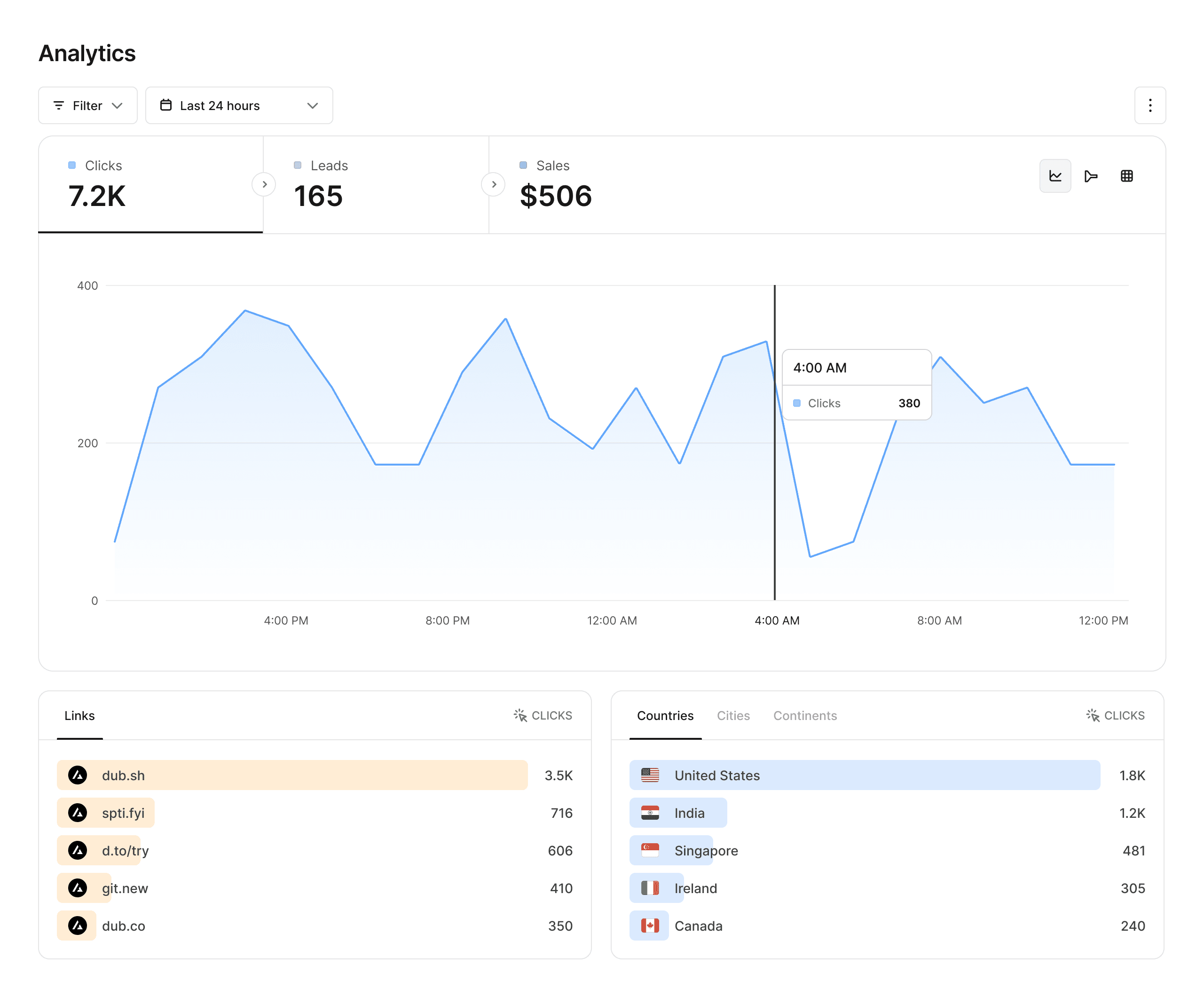
Analytics that matter
Dub provides powerful analytics for your links, including geolocation, device, browser, and referrer information.
Advanced link features
Supercharge your links with custom link previews, device targeting, geo targeting, link cloaking, password protection, and more.
Collaborate with your team
Invite your teammates to collaborate on your links. For enterprises, Dub offers SAML SSO with Okta, Google, and Azure AD for higher security.


Supercharge your marketing efforts
See why Dub is the link management platform of choice for modern marketing teams.


